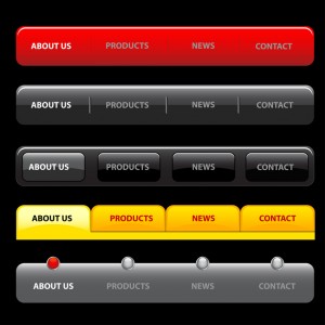
Navigation Menu
A website’s navigation menu guides the users to different parts of the website, making it the link between its various useful web pages. Designing an effective navigation menu is one of the easiest ways by which you can keep your customers interested in the various stuffs your website is to offer.
 Modern website designers play with the various concepts of creative menu design, from simple to ultra complex menus, they come up with different “shapes and sizes” both literally and figuratively. But, what makes a navigation menu tick is its ease of use and customer comfort.
You may have a design that looks extraordinary, but if it fails to impress the users due to its lack of usability, then it most likely will not serve its purpose and will hit the drawing table before long. Therefore, before going with a website menu design make sure it is apt for easy navigation and compliments the website’s services or purpose.
Now, with that said let’s have a look at the different ways by which you can design a navigation menu that works. To begin with, here are what HTML5, CSS3 and jQuery have to offer.
HTML5 & CSS3
jQuery
Using these tools to design a navigation menu, allows for us to take advantage of all the specialized features they offer the developers. Here’s a quick look on what can be achieved, when these features are put to good use.
Responsive Navigation Menu
Being one of the trickiest parts of designing a responsive website, the responsive navigation menu offers the best accessibility to the users and allows for them to experience the convenience of the desktop’s menu system while offering the comfort of mobility. All top website designs usually feature responsive navigation menus as part of their design, ensuring flexibly and enhancing the website’s reach amongst its users.
User Enabled Technology
It is of atmost importance that JavaScript, jQuery, Flash, etc are used gracefully such that they offer degradability in the event of browser incompatibility. Now everyone will not be using the same browser or for that matter the same version of the browser, hence it is best to incorporate code fallback solutions when applying your navigation menu design ideas. These fallback options will provide the users with conflicting browsers or even hardware to experience trouble free alternatives to the default menu setup.
User-Friendly Terms
As mentioned earlier, the best menu design is the one that exerts least amount of strain to the user, both in terms of menu layout and in giving clear perception on where they are in the website’s hierarchy.
To attain this, the developer must ensure the consistency of the navigation design through all the web pages; this will keep the users comfortable and allow them to feel familiar with the design. Along with this, Breadcrumb navigation is an option that you must provide your users with, as they give a sense of direction to them. Most feel that this is a hassle that a designer can live without; however, the convenience in using the breadcrumb system outperforms its development effort.
Getting your website design up and running, is an effort that requires understanding of the target customers and their requirements. An expert web design and development company will be able to offer all this within a simple package.