We find web to be the most engaging tool ever in this universe. You can never deny this statement because everything and anything is on the web. This is the reason behind any business to develop a website.
Everyone is more concerned about their online presence. Starting from the small to the big businesses, everyone is really mindful of what they are and how can they develop their presence.
To help such businesses I have come up with some of the recent and the best updates in website design that makes your business unique and outstanding to your online audience.
Eager to know the updates?
Let’s Get Started!!!
To get the elements aligned together on a webpage, web designers make use of a simple technique which is the grid layouts. This design is been around for quite a while. But there is a shift in the way they are being used.
Most famous platforms such as WordPress also makes use of grid designs as the source for templates. Earlier in March 2017, CSS grid was introduced which introduced additional options to its users. Maybe this year we could expect a lot more towards designers using neutral space and more uneven grid layouts. Using these grid layouts replicates an ultra-modern design style.
The basic style structure includes white space which highlights content and makes it easy to navigate. These styles better help users to spare more time on the website.
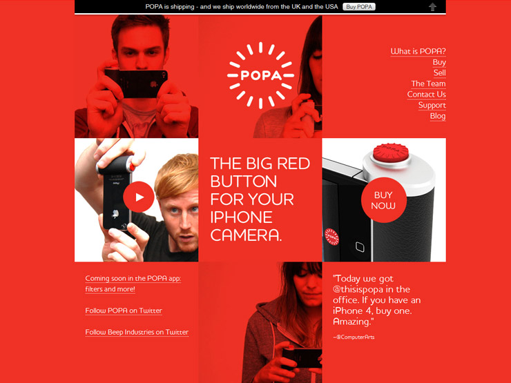
Animations are the terrific impact creators. In this fast-moving world, people do not have time to sit and read paragraphs of content. To make this a better experience for your audience, you could convey your content through effective animations.
Storytelling is the one which most new as well as old brands highly concentrate in order to capture users attention. Animation makes this process much more interesting.
Animations have so far shown the brands their strength in our digital world providing a strong personality to the brand. So you might expect what more is animation going to project this 2018. As we have already come across animated logos that builds up big opportunities to intensifies brand further.
Making it much better in a right perspective is the highest responsibility that any brand could have. But did you ever think what makes these animations more effective? The intensity of the creation tools had a huge impact on the developers. This further opens up the chances of exploring more and more on animation.

The famous social media platforms have made micro interactions a familiar one. Yes, Now users can contribute their variety of reactions to posts and even private messages as they share.
These micro interactions can be contributed to other users as well without even reloading the page. This has brought a lot more changes to the user experience. The minor inconveniences were replaced by these micro-interactions which leveled out the speed bump of reloading on other pages.
Implementing these micro-interactions on your website this year would improve the interaction level and even make your audience to stay on the page for a long time. Make sure when you do this you need to manage your website alongside.

Flat designs are preferably the most common technique that is used widely in web designs. But at recent days gradient colors are making its way in 2018. Gradients were used earlier but in a form of delicate shades to suggest 3D.
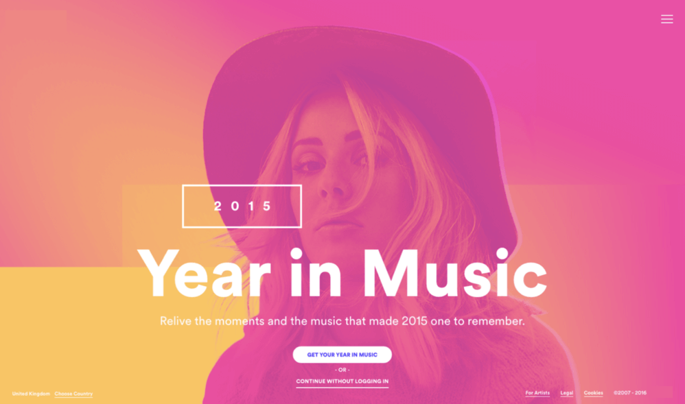
Recently, these gradients have become common and that they capture the major, loud and full color on web designs. The popular and the recent substance is the gradient filter on photos. This makes even a simple image to look interesting.
A plain gradient background can also make the entire presence a beautiful one and even an on-trend solution in case if you lack images.
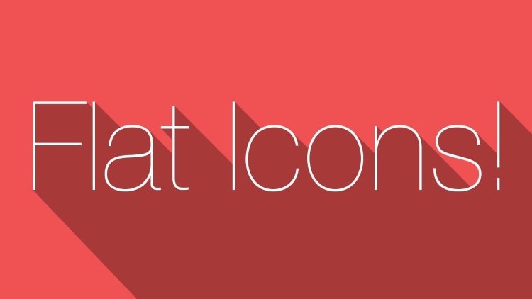
Illusions are best players and making them more intensive brings better interactions. Shadows build depth illusion. This has turned out to be trending in the designer community.
Initially, I have recommended for 2D designs in one of my earlier posts. Now you can add more essence to it by using shadows to with which makes it more intensive.
But make sure that you use these techniques in the right spot that they gather the whole attention of your audience. Hope you have guessed where it should be placed?
Exactly!!!
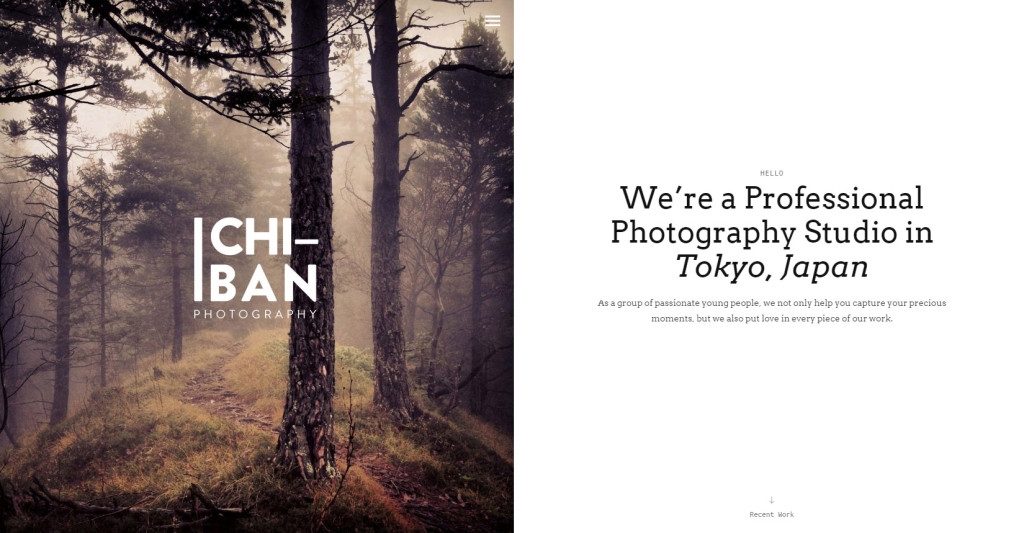
Increase spacing on your web page with split designs. At recent times empty spaces with split images and even half pages capture the attention of the audience.
For example make separate the image from texts that you could make it more effective and attractive. By following this technique you opt to throw in a lot of content without disturbing your user experience.
Scroll trigger animations are the other interesting factor that makes scrolling on your website an interesting experience. With specific or unique triggered interactions you increase website engagement among your users.
I would present you an example of scroll triggered animations, This technique is used by Apple. They might not appear new yet they are supposed to be used in a different way.
Some of the best scrolls triggered animations are as follows;
The scroll triggered animations are meant to clean up your website with a concise the design to make that feel and look great. Rather using buttons and list of menus you can make use of this technique to make your website more attractive as well as interactive to your audience.
You would have heard this word for decades and may be out of trend. Yet you can never imagine a web experience without a responsive design. Responsive designs are meant for websites to appear the same on all screens.
Though the revolution in user experience is seamlessly observed only in these few years, it is still considered really important. It is expected to take a different perspective this year with the involvement of augmented reality and virtual reality.
The scalable vector graphics format is not new to the world of website design. It is something that is expected to overcome the old and traditional formats like PNG, GIF, and JPG.
As SVG images are vector formats that are not pixels. This gives the best advantage. They are amazingly scalable, which obviously helps with maintaining the quality of the image.
The most important thing that really matters on handling a website is the website speed and this would be probably simple even on adding SVG images. These images do not bother page speed even when they are animated as they do not require any HTTP requests.
SVG is the best form of providing quality multimedia experiences in 2018 which includes 360-degree views, cinematography, and 3D images.
Pairing web services along with Internet of Things is one of the most important trends in 2017. This is expected to take more effect in this year too. Things are expected to use sensor arrays and server-side processing to accept and act on the environment.
Applications that allow developers to interact and communicate with devices are precisely found which further leads to more interconnectivity in the next few years.
This year is expected to have a lot of improvements and advancements in the world of website design. With all these advancements one could carry his business to an unimaginable destination.
If you are the one who is trying to make your online presence the best and approachable one, make sure that you are covering all the above-mentioned techniques and strategies in your website design.
When you afford to miss any of these web design trends, then am sure you are about to miss a huge conversion. If you are lacking any of these updates ensure that you get them on track to make the best out of it.
Never fail to let me know your success stories.